


7 infographics that have impacted the world since circa 38,000 BC
![]() 5 Minutes Read
5 Minutes Read

Did you know that 90 percent of all information transmitted to the brain is visual and the human brain processes images 60,000 times faster than text? While studies back these claims the emerging digital media trends are a testimony in itself.
With visual content being 40 times more likely to be shared on social media, the use of infographics and images in marketing and communications has seen an exponential growth. INFOGRAPHICS THAT HAVE IMPACTED THE WORLD Today, marketers and advertisers are grappling with the shrinking attention span and a target audience born in the digital era. And that is where infographics have proved to be a vital marketing tool. Bring together some compelling content in form of stats and striking visuals, and you have a guaranteed conversion.
While infographics appear to be new-age and digital, would you believe that the first infographic was created somewhere around 38,000 BC? Curiosity got the better of us and a search later we stumbled upon this collation of infographics that have made a mammoth (no pun intended) contribution to the world.
1. Parietal Art
It was almost 40,000 years ago that cavemen first took a fancy to art — and hand-created the world’s first infographics! Parietal art, commonly referred to as cave paintings, this constitutes the first form of infographics. And why shouldn’t they be — given the fact that they do full justice to the word’s portmanteau of ‘information’ and ‘graphic’. Today, they give us a glimpse of the culture, traditions, beliefs, and customs prevalent at that time — stories relating to ancient man, depicted pictorially.
 Image source: Wikipedia
2. Egyptian Hieroglyphics
Around 32 BC, Egyptians developed a rudimentary system of writing, combining logographs, syllabaries, and ideograms. Later, the Mayan and Indus Valley civilisations also found inspiration in hieroglyphics and developed a similar system of non-verbal communication.
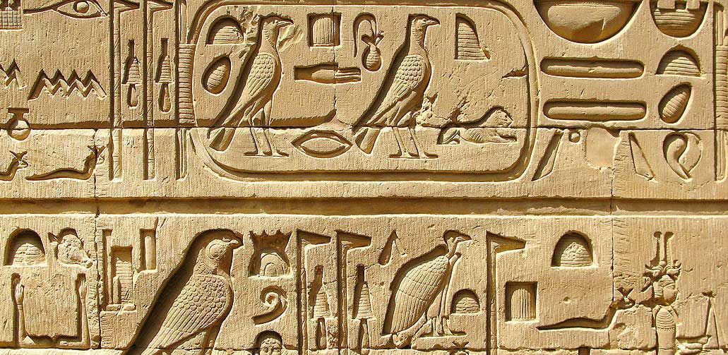 Image source: Historyplex
3. Leonardo da Vinci’s ground-breaking sketches
We all know Leonardo da Vinci to be a painter and a man of exceptional genius. How many of us know that he is also credited for his revolutionary visualisation in the 15th century, which led to the profound understanding of the human anatomy, and later, to the invention of the parachute, the helicopter, and the military tank? On receiving permission for human cadaveric dissection, he went on to dissect 30 corpses, thereby giving mankind one of the earliest comprehensive illustrated guides on the human anatomy.

4. Florence Nightingale’s statistics on war mortality
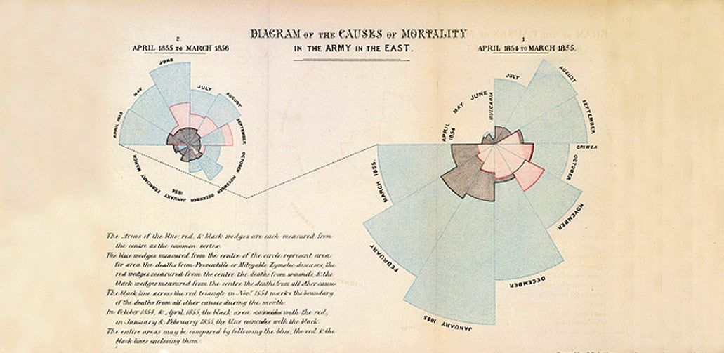 Image source: Understanding Uncertainty
This ‘lady with the lamp’ is honoured equally for being a social reformer and statistician, as she is for being the founder of modern nursing. In 1857, after being deeply moved by the apathetic administration in the London Workhouse Infirmaries during the Crimean War, Florence championed the cause of improved conditions for treatment of the injured soldiers. While recuperating in hospital, over 4,000 soldiers had already succumbed — not to their war wounds, but to typhus, typhoid, cholera, and dysentery. She then wrote a letter to Queen Victoria, citing the lack of hygiene, nutrition, and medical supplies, and the overworking of the soldiers as the main causes of high mortalities. She backed her plea for support with statistically accurate bar and pie charts in coxcomb design and managed to convince the sovereign to take remedial action.
5. John Snow’s map for tracking cholera
John Snow (with an ‘h’, if you will), was an English physician and is regarded as the father of modern epidemiology. During the outbreak of cholera in 1854, he created an infographic in which he mapped all the deaths in London to their respective sources of water. This helped the health authorities zero-in on a single water pump that was contaminated with a baby’s diaper. Through this, Snow established that at least one disease could be linked to contaminated water.
 Image source: Wikipedia
6. The World Map, courtesy Martellus
In 1491, cartographer Henricus Martellus produced a world map that, for the first time, illustrated the Cape of Good Hope. The map was also reflective of the Renaissance and new land discoveries at that time, including several islands. It is believed that Christopher Columbus relied on this map to garner support from King Ferdinand and Queen Isabella to set off on his journey across the Atlantic. Today, his map is preserved at Yale University.
 Image source: Wikipedia
7. The Bill Gates Foundation infographic on Malaria
Coming back to our age, we have an example from 2014 of the Bill Gates Foundation using an infographic that makes us sit up and take notice of the increasing menace of malaria. The infographic, which is very simple and uncluttered, shows that of all the human deaths related to animals, the ones on account of mosquito bites happen to be the most. Apparently, this infographic made a lot of news, and helped increase awareness.
 Image source: Gatesnotes
The trend emerging from these infographics shows that as man evolved and advanced, so did the style and refinement of his visual communication. The power of infographics is undeniable. Call it Data Visualisation or Visual Storytelling, it has almost always scored above plain text communication.
Read other blogs

Communication Strategy
Move Beyond The Scroll: How AI is Revolutionising Interactive Storytelling On The Web
Read more
Communication Strategy
How Interactive Digital Magazines are Driving More Engagement than PDFs in 2025
Read more
Communication Strategy
Once upon a time…..and even today – storytelling works very well for employer brands
Read moreLet's create communication that drives results!
